- What we do
- Works
- Pricing
- Insights
- Company
- Contact Us
June 10, 2020
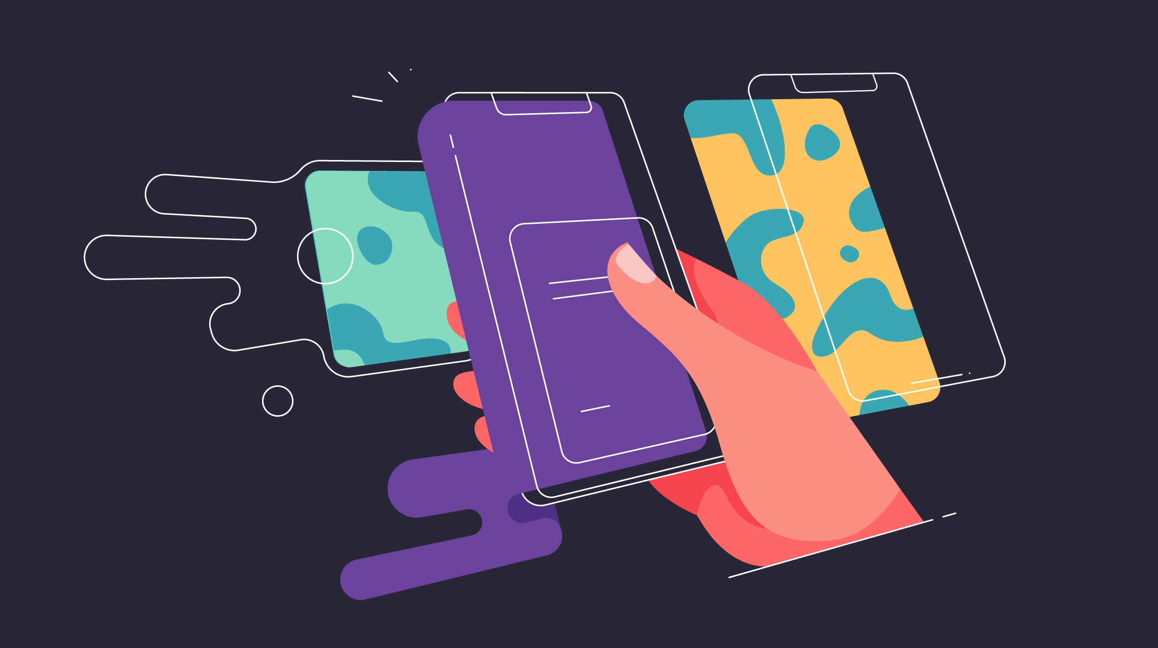
How to Make Your App Store Page Look Great
When your app is done, it’s time to think about its presentation to potential users — what to show on screenshots, how to compose its icon, what to write for its description. Here’s our little guide to making a fantastic App Store page for your future product.
Today’s smartphones can do almost everything! You can professionally edit photos and videos, listen to music, play games with amazing graphics, and keep track of your health. Millions of apps with an enormous range of functions are available to everyone in the various app stores.
Since so many apps provide people with such vast functionality, competition is intense and customers can be really picky. To grab the attention of your target audience, you need to highlight every possible advantage of your product and make it shine against your rivals.
A very important stage in this process is your app’s page in the digital store. When a user is thinking about downloading an app onto their phone, this page is where they must go to learn more about it. Since Google Play and the Apple App Store are the most popular digital stores for mobile apps, most marketing efforts are focused there. However, these two services require different approaches.
Today we will speak about visual optimization of your app’s App Store page. We’ll explain the basic principles of the page and present an example of how to organize it.
App Store page basics
It’s not enough for users to find the page to download your app. There is one more stage in the sales funnel, where they decide if your app meets their needs and if it’s really necessary to download it. Typically, a potential user needs only two or three seconds to make their final decision, and there’s no 100-percent guarantee that they will make the choice you want.
An App Store page is structured like this:
- Icon
- Title
- Subtitle
- Description
- Screenshots
- Video preview
- What’s New
- Information
- Keywords
Some of these are part of App Store optimization, like keywords, title, and subtitle. These items should be SEO-optimized to be correctly indexed by the search engine, but this is a topic for a whole other article.
Let’s focus on visual optimization — how to make your App Store page look great and what to highlight there for potential users.
App Store page visual optimization
Icon
The first thing that you see when you search for an app, even before going to the page itself, is its icon. This little image represents your app in different App Store sections and becomes its icon on the phone screen after installation.
The fundamentals of icon design for an App Store page are:
- Scalability — Despite the icon’s tiny size, it still should look absolutely the same on every type of screen, from the iPhone settings menu to widescreen monitors. When designing the icon, there are two important factors to take into account: the scalable size of the icon and its detalization. The composition should be simple and to the point, without any unnecessary details that would look heavy in a small-sized version.
- Memorability — One of the main purposes of an icon is to attract attention and stay in the user’s memory. When a user browses through the search feed, your icon should be the most memorable and elicit the strongest emotional response.
- Consistency — The icon should reflect the main point of the product and correspond with the app’s name and purpose. For example, if your app is dedicated to meditation and yoga, it would be weird if it featured running people or someone lifting dumbbells.
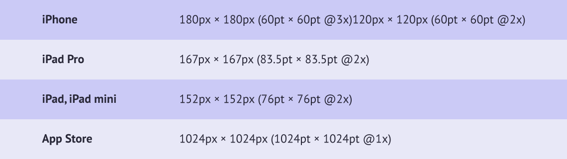
These are the main technical requirements for an iOS app icon:
Screenshots
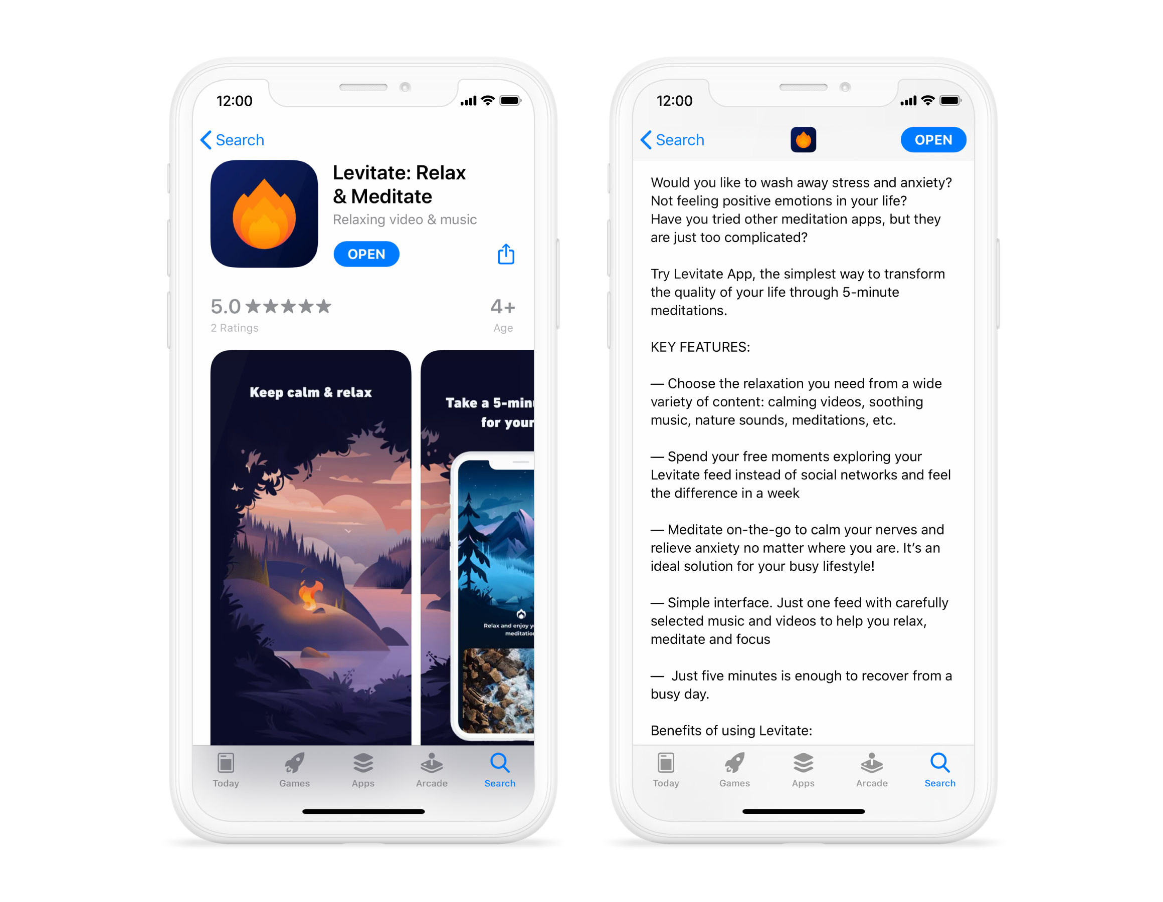
The screenshots section is the most informative visual part of the App Store page, since it allows you to highlight the many advantages of your app. You can upload up to ten pictures in two formats, JPG and PNG (the last format must have no alpha-compositing). You should pay the closest attention to the first two screenshots, since the user sees them first and often scrolls no further. To grab the user’s attention, these two images should be your most captivating ones.
Essentially, an App Store screenshot is not a pure screenshot. It’s a background with a title and a mockup of the screen itself. The images can be vertical or horizontal, depending on the app’s orientation. Besides the title that describes the app’s main advantages and the mockup, the screenshot can include other information, like App Store awards or the latest functionality updates. Data like this can improve CTR (click-through rate) and increase downloads.
But that’s not everything you need to take into account. The next step for screenshots is work on their localization. If your target audience is not limited to one region, it would be best to have localized screens for every country. The simplest example is language: For the USA, titles should be in English, for Latin America — Spanish or Portuguese, and for Russia — Russian, but you might also change the visual itself, since some pictures work more efficiently in some regions and don’t work at all in others, like the White House in the US and the Kremlin in Russia for a news app.
All metrics for app screenshots are given on Apple’s site.
Note: iOS 13 introduced a dark mode feature in the App Store, which means some elements might now be displayed incorrectly. Be sure to take both modes into account when making screenshots and the icon for your future app.
Video preview
An app’s video preview in the App Store comes before all screenshots and demonstrates the app in motion. One important point: This video is not an advertisement. Its main point is to show key actions that can be done with the help of the app. Basically, it’s a recorded phone screen that shows part of the user flow.
You can upload up to three video previews, but we don’t recommend using more than one. That will be enough to display everything a potential user needs to see. The composition of the preview is the same as for screenshots, and just like screenshots, videos can be horizontal or vertical and have their own specifications.
Description
The description is a major text part of the App Store page. Each person has their own approach to this. Some people write long stories that describe every single detail, while others limit themselves to just a few words.
Even though the description contains most of the text, it doesn’t play a big role in decision making. As users examine the icon and screenshots, they receive enough information to decide whether to download the app or not. Usually, this takes just two or three seconds. Only the pickiest users read the entire description.
Still, there are some rules that will make your description more attractive to readers:
- The first five lines are the most important. They should contain the main information about the app.
- Unlike Google Play, App Store descriptions are not indexed, so there’s no need to build your text around keywords.
- Big paragraphs are best split into smaller ones, since that improves comprehension.
- Feature lists are best presented as bullet points, not in one line.
- In the description, you can write about new features, plans, and trials, and mention links to social networks, your privacy policy, and terms of use.
- It’s a good idea to finish your description with a call to action like “Download and play!”
Note: The best way to find out what texts and visuals work best is A/B testing. The App Store itself doesn’t give you this opportunity, so third-party services like Splitmetrics can help. Another way is to use different visuals for different periods of time. While it's not as effective because the campaigns are not simultaneous, it still yields results.
To sum up
To present your app in the App Store, you need to pay close attention to every part of its page. Every visual element should tell a user about your product and relate to its main functions. If you follow our guidelines above, the target audience will remember your product and download it.
✔Read also:
Got a project in mind?
Fill in this form or send us an e-mail
Subscribe to new posts.
Get weekly updates on the newest design stories, case studies and tips right in your mailbox.