- AI Transformation
Our AI Team
Sofia
Ivan
Vlad
Anton
Technolody Stack
- Services
Full Cycle Development
By Industry
- Works
Featured Cases
See All CasesOther projects
AI Learning PersonalizationSmart content recommendationsHotel AI ConciergeAI assistant for hotel guestsClaims Documentation AutomationPlatform for faster claims processingAI for Candidate ScreeningSmart HR efficiency boosterAI Voice AgentAI agent for hands-free learningLLM Legal SummarizationEfficient and fast legal summariesVision-Based Driving AssistanceReal-time threat detection system - Company
Yellow in Numbers
$2.1B+
Value generated through AI innovation47
Custom LLMs and AI agents deployed30M+
Engaging with products we created98%
Projects delivered within agreed budget
A couple of months ago, we at Yellow noticed the rising interest in mobile apps that provide tools for meditation, mental health, mindfulness, and relaxation. Experimentation is our second nature, so we decided to jump on the bandwagon and try our skills in that area.
However, having observed so many ideas (our own and others) fail in finding product/market fit, we knew:
- Failure is painful
- Building a good product takes time and money
- Competition is strong
- Most importantly: You can’t know if the market needs what you’re building until you give it to the market.
So what did we do? We decided to sell the product before we start actually building it.
How do you sell something you don’t have? Make it seem like you do!
Preparation
Step by step, we:
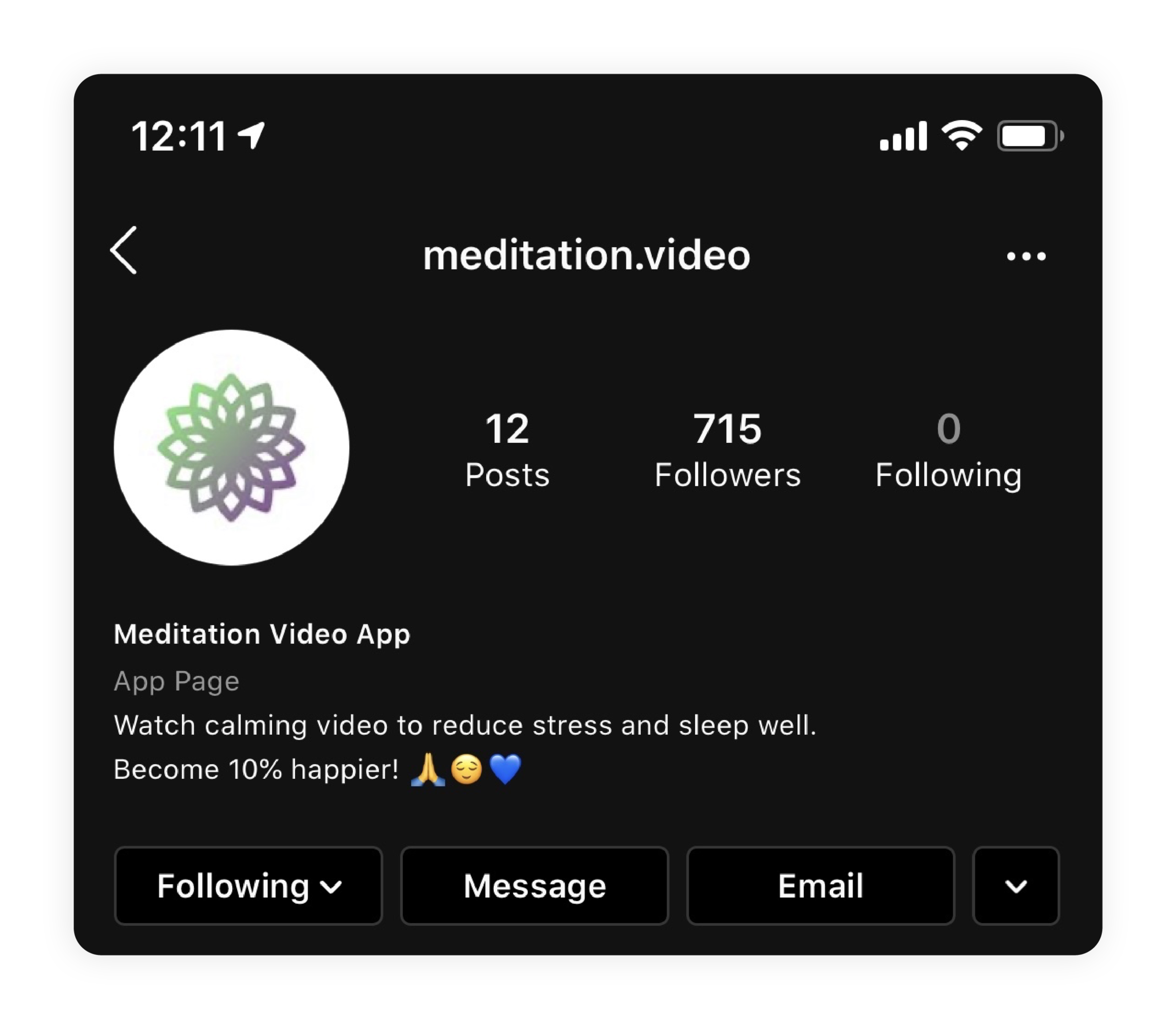
1. Created an Instagram account called "Meditation Video App”

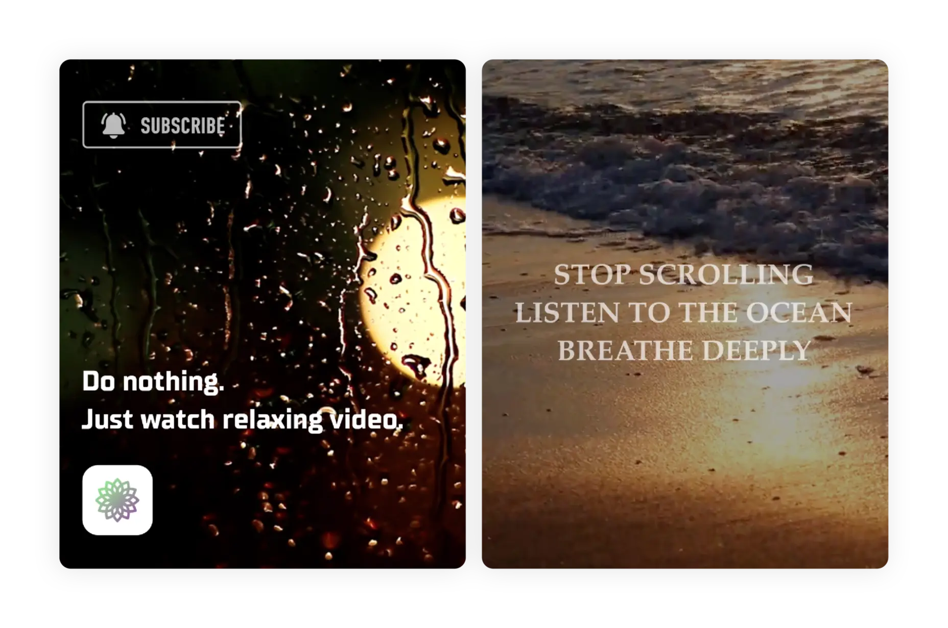
2. Filled it with some relaxing (even if a little silly) pictures and videos

3. Created a couple of Facebook ad campaigns (we say Facebook, but the platform of choice will only be Instagram) with inviting content (but again - nothing fancy, purely simple, primitive ideas)

Once the above was done, we launched the ad campaigns with a daily budget limit of just $15.
Advertising
After a couple of days, these were the numbers we had:

Abbreviations in the first line mean: United States/Canada/Australia/United Kingdom, Female/Male, Age 25-65, Instagram only.
To decipher these results, here’s what you should be looking at:
- CTR (Click Through Rate): 2.38% in our best ad campaign, 1.76% in the second-best (depends on the choice of creatives for each ad). Everything above 1% is good, so our numbers were very good!
- Post Reactions: 289 out of 28,830 impressions, which is a nice rate.
Combined, all of our ads generated 1,389 clicks, and 724 people started following us. In other words, every second person who clicked on our ad became a follower. Not bad!
So these numbers were looking good, but was that enough?
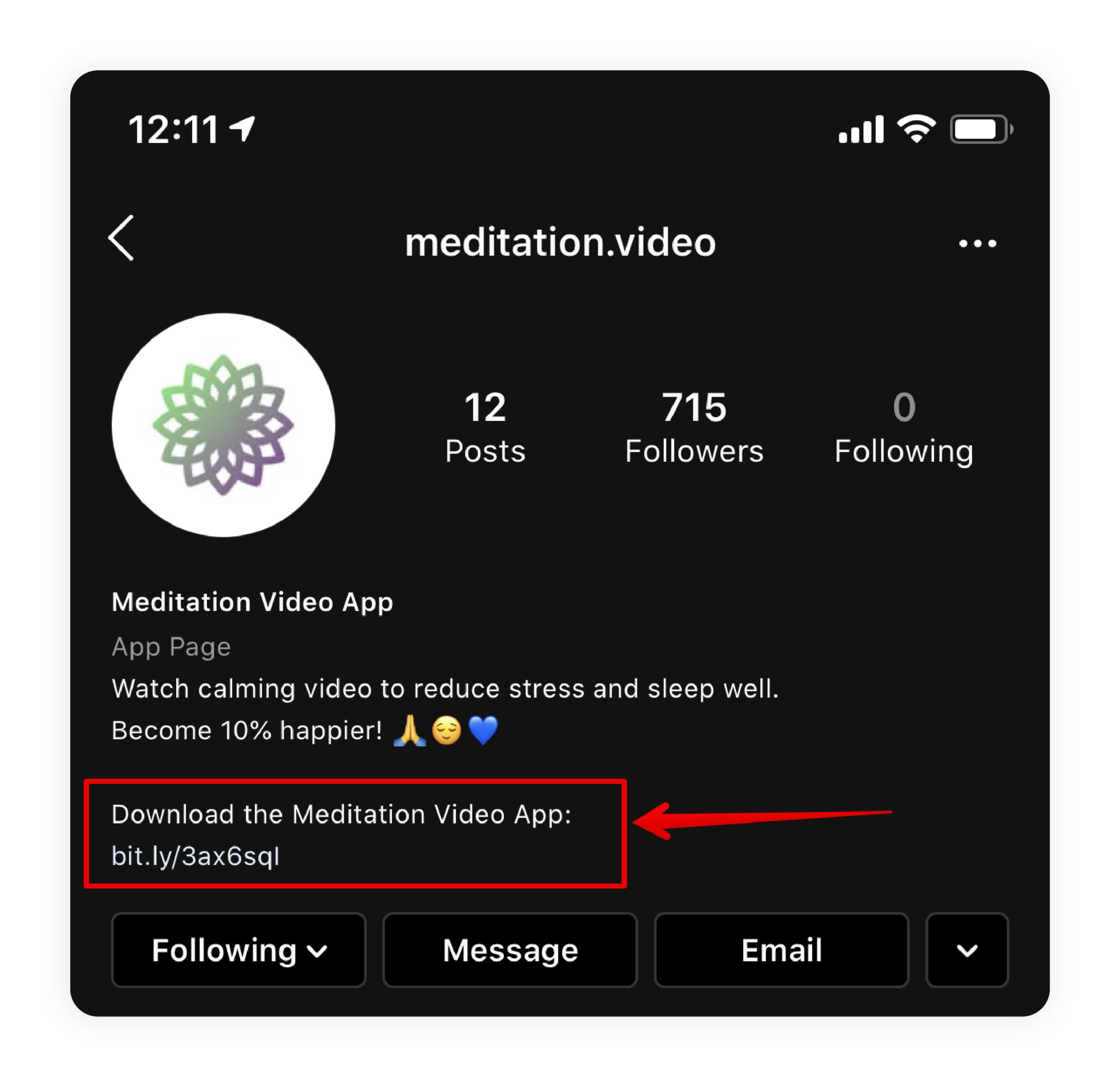
To take this one step further, halfway into the experiment we decided to put a link to a Google Form into our profile for people to fill out, and measure people’s interest this way too. We figured: If people go to such a length as to click on a form and leave their email (quite an effort to invest into something they have no idea about!), it means genuine interest.
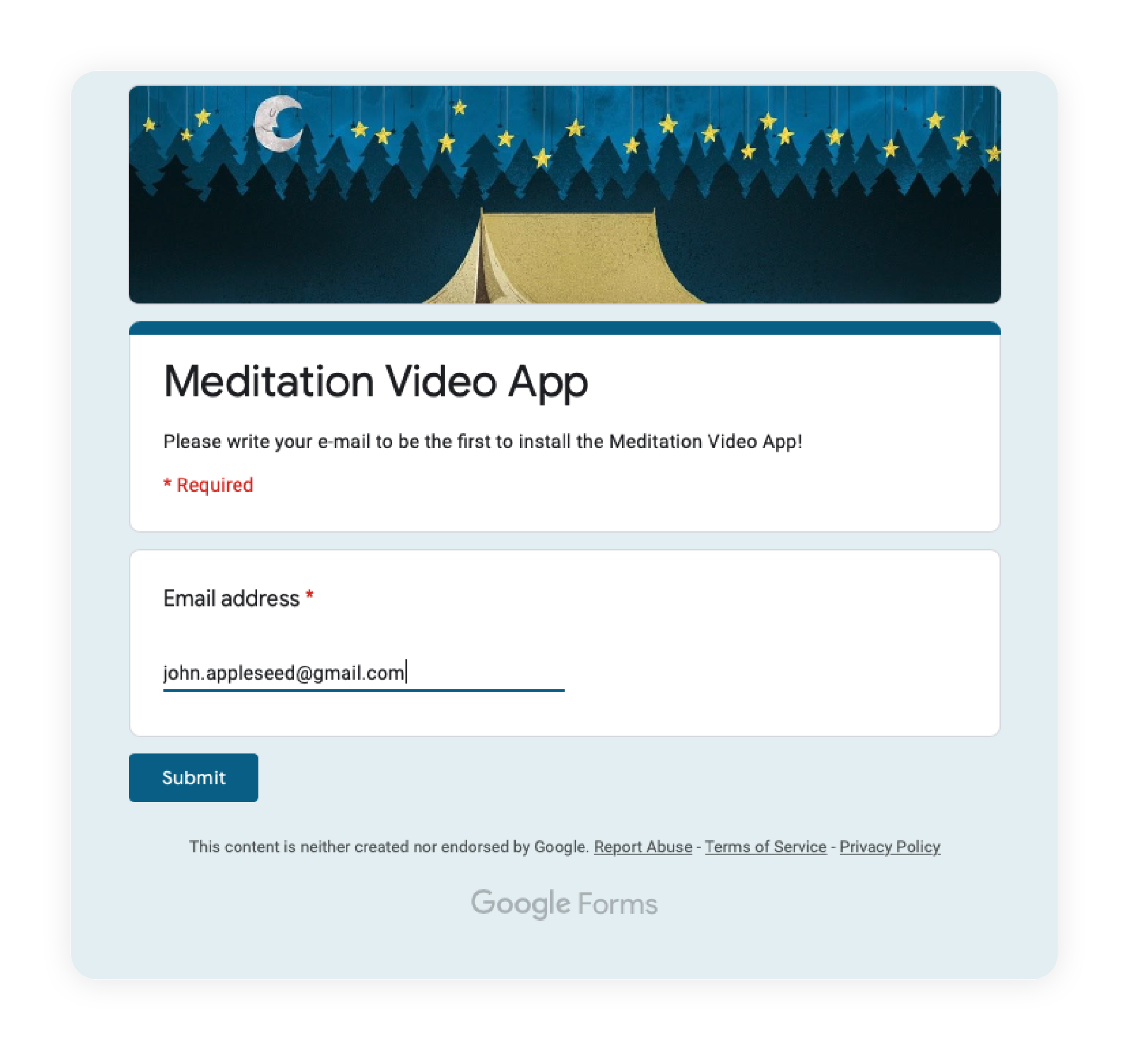
All we asked of people was just to leave their email so that we could notify them once the app went live:


To our astonishment, people were leaving their emails!
Out of around 500 people who saw our Instagram profile with the Google Form link, 65 left their emails.
Just think about it for a moment. People are going as far as clicking a link, leaving their email and submitting it – all for a product that’s clearly not revolutionary, and one that they didn’t even know existed 10 seconds ago! Is that something you would do? I’d never do it, perhaps. This is a good illustration of why you shouldn’t make deductions based on yourself.
Once the numbers were high enough to draw preliminary conclusions (over 350,000 people saw our ads), we stopped the campaigns. The total budget for the ads was $126.
Is it a little or a lot? Compared to the development costs, it is nothing. Which means there’s absolutely no reason you shouldn’t test the waters this way.
Gauging
Having collected the data above, we could do some math.
Out of 1,389 people who clicked our ad, the last 500 or so saw the Google Form.
Out of the $126 total budget, $45 was spent on these last 500 people.
Out of these 500, 65 people filled out the form.
$45/65 = $0.69. That’s the price we paid per person who left their email.
Is the effort required to leave your email smaller or larger than installing an app? It’s larger in my opinion, but let’s assume it’s smaller. Let’s assume there’s 20-40% more friction for a person to install the app. So let’s add another 20-40% to $0.69. It makes the expected price per app install around $0.80-1.00.
In other words: we’ll only have to pay around a dollar per user who installs our application.
A dollar is not a lot. If we manage to provide enough value to people, they will stay in the app, and it’s safe to assume that the average person will spend more than a dollar for a good product during their lifetime (the cost of average user acquisition).
To translate that into a lifetime value of a paying user (LTV): If we expect that 30% of the users will subscribe to a free trial, it makes the price of a trial user $3.33. If, out of the ones who subscribed to the trial, 30% in turn end up paying, we can estimate that we’ll have to pay $11.1 per paying user (the cost of paying user acquisition).
Conclusion
Obviously, this only meant that there’s demand. People need a product like this one, that’s clear. Are they willing to pay? Will ours be good enough? Will unit economics work well? Only time will tell. But remember, we only spent $126, and that allowed us to make an informed decision, instead of one that was totally random and subjective. Just because you like an idea, doesn’t mean it’s worth your investment!
Going forward, we will understand:
- Were we cherry-picking? In other words, were we only seeing the data that we wanted to see?
- Did it take us too long to release the product? We’re only a couple of weeks away from release now, but the world has changed so drastically in the last six weeks alone.
- Is pre-COVID data relevant in the COVID and post-COVID eras?
Bottom line: SELL before you BUILD. It might not be a perfect indicator, but it’s an indicator! At least it’s something.
Got a project in mind?
Fill in this form or send us an e-mail
Subscribe to new posts.
Get weekly updates on the newest design stories, case studies and tips right in your mailbox.
