- AI Transformation
Our AI Team
Sofia
Ivan
Vlad
Anton
Technolody Stack
Our Clients
Featured Cases
- Services
Full Cycle Development
By Industry
- Works
Other projects
AI Learning PersonalizationSmart content recommendationsHotel AI ConciergeAI assistant for hotel guestsClaims Documentation AutomationPlatform for faster claims processingAI for Candidate ScreeningSmart HR efficiency boosterAI Voice AgentAI agent for hands-free learningLLM Legal SummarizationEfficient and fast legal summariesVision-Based Driving AssistanceReal-time threat detection system - Company
Yellow in Numbers
$2.1B+
Value generated through AI innovation47
Custom LLMs and AI agents deployed30M+
Engaging with products we created98%
Projects delivered within agreed budget
November 26, 2019
How We Developed Drive Focus, the Perfect Training Tool for Enhancing Driving Skills
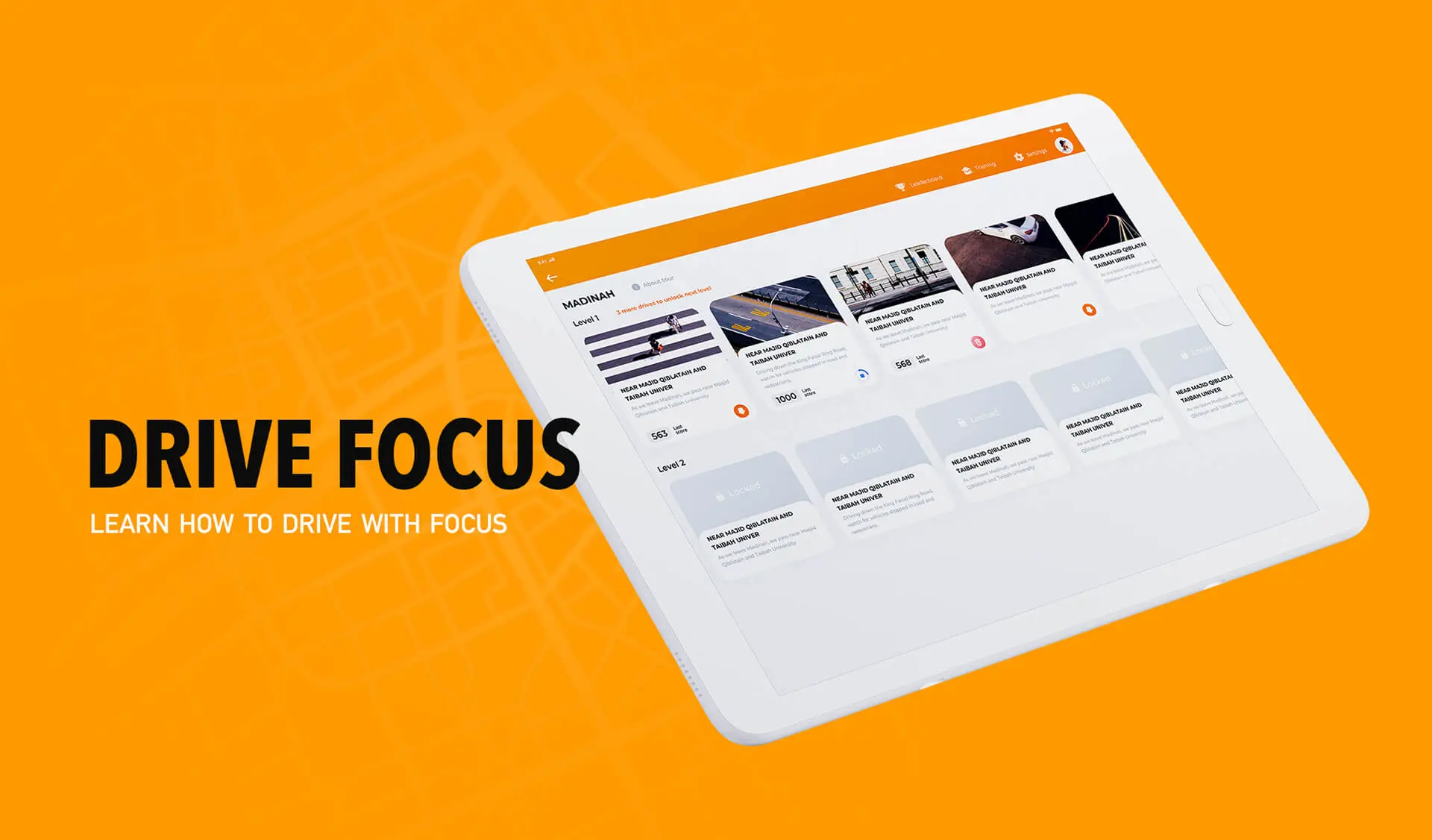
Meet Drive Focus – a tablet app for Android. It helps drivers rehabilitate after difficult medical conditions or life experiences that have affected their driving. The app will be of particular use for driving schools, universities, and medical research centers.
Until AI cars have captured the global market, human driving skills will remain to be of crucial importance for private transportation. However, learning how to drive can be tough, and driving skills are easy to lose. Individuals with traumatic brain injuries, autism, and attention deficit disorders face a number of challenges during driver rehabilitation. War veterans and emergency drivers also heavily adjust to the “normal” driving environment, especially after a long tour of duty.
Therefore, those who have various difficulties with orientation in the driving environment require training modes to learn critical information that drivers must react to. In spring 2019, we signed an agreement with the Driver Rehabilitation Institute to develop the Drive Focus application, a visual training tool for practicing driving skills. This article will tell you the story of how we created a fun and interactive app to improve driving reaction and confidence. Let’s get started!
Our client
Our client, the Driver Rehabilitation Institute (DRI), is a California-based nonprofit organization focused on a spectrum of services for driving training, education, and rehabilitation. The DRI cooperates with driving schools, therapists, and rehabs. Furthermore, the DRI has arranged mutual projects with a number of universities, including Harvard University and Beth Israel Deaconess Hospital, University of Florida, and University of Western Ontario. The idea to create the Drive Focus app came about after several meetings with US veterans.
Project Goal
We needed to make an application for helping both professional and novice drivers to enhance their skills. Therefore, users would watch short interactive videos of real driving experiences and tap on various critical objects on the road. The app also had to be suitable for people recovering after complex medical conditions or life experiences that affected their driving.
Work
Our company has created the Drive Focus Android app for tablets and we also plan to proceed with an app for iPad. Initially, we received a poorly functioning iOS app as a basis for the Android tablet app. Subsequently, we created a fun and interactive Android app for tablets. We used a range of advanced technologies, including Google Cloud Platform, Docker, React, and Kotlin programming language. We also paid particular attention to UX design.
Results
As a result, we have developed a highly innovative application for learning and improving driving skills that is suitable for novice drivers, war veterans as well as those who are suffering from a poor medical condition. In the future, the app might be expanded to train emergency and firefighting crews. The app is expected to be distributed by Google Play for $12.99. In addition, it will be promoted by driving schools, universities, meetups, and conferences. Apart from that, the data derived from the app’s statistics on the progress of driving reactions will be studied by various research centers.
Project Duration
6 months, June – November 2019
Team
- Project manager
- Android developer
- Front-end developer
- Back-end developer
- Designer
Technologies
- Google Cloud Platform
- Java (SpringBoot based services)
- Docker
- PostgreSQL
- Ant.design
- React.js
- Redux
- Redux-Saga
- Swagger
- Android tech and libs
The Product
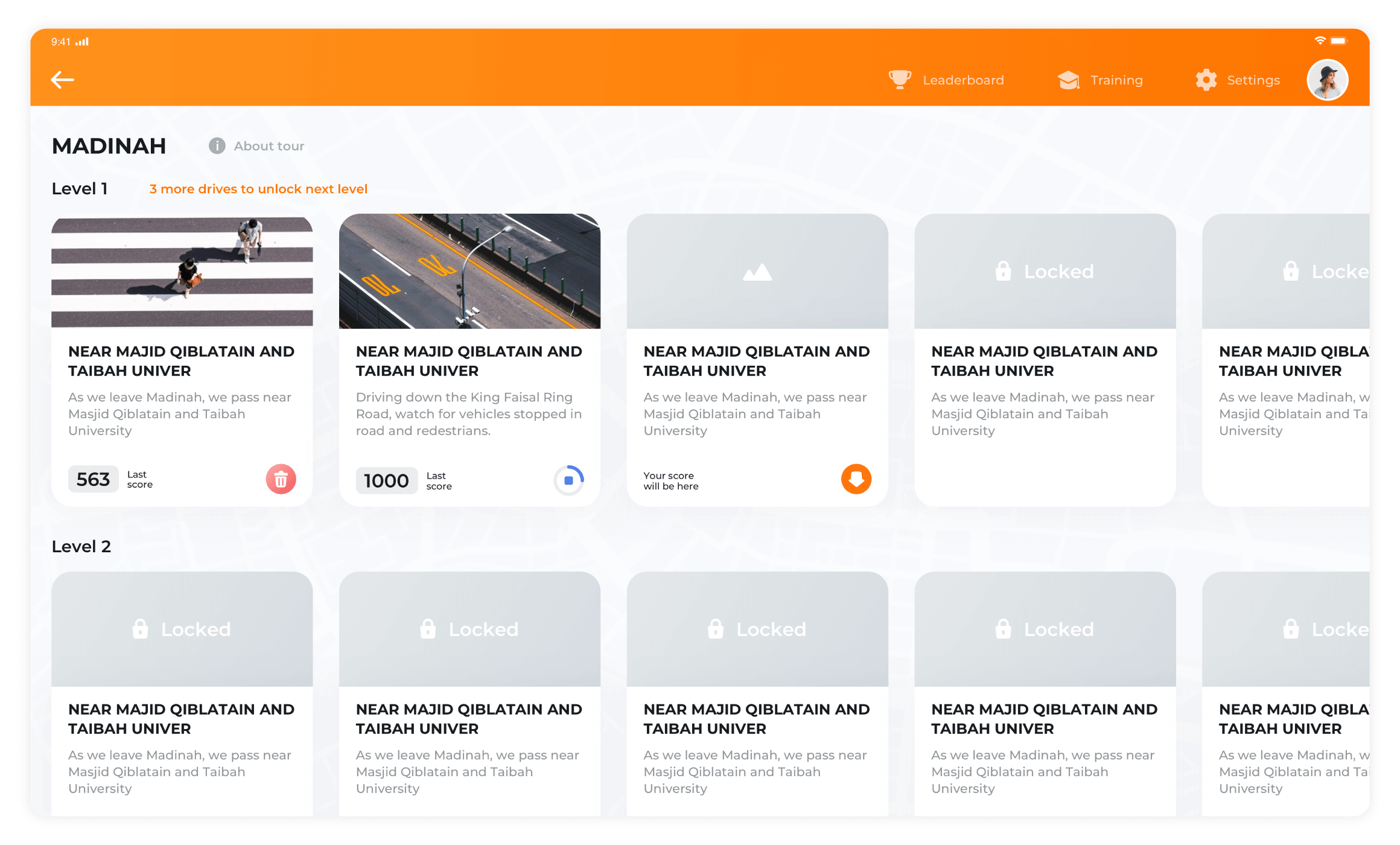
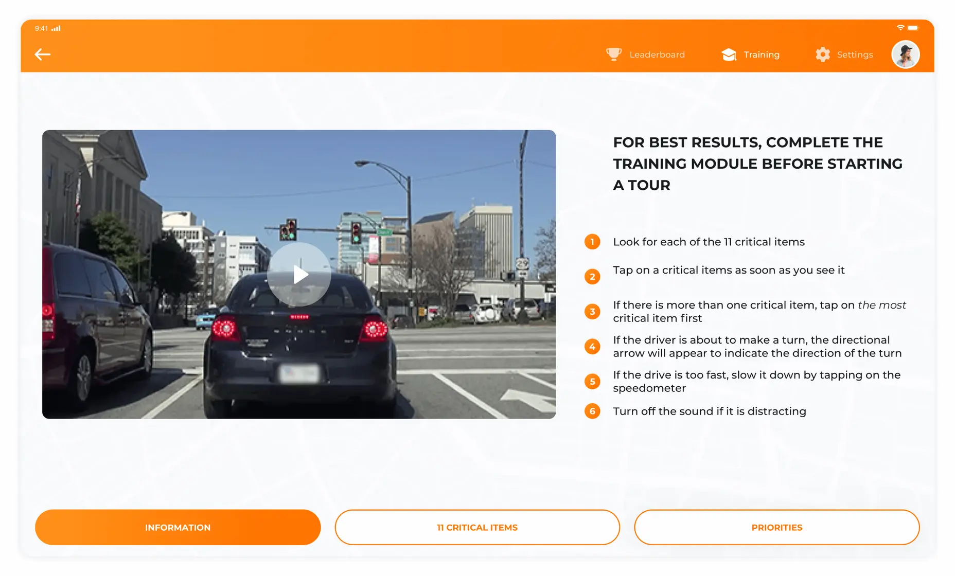
The app comprises interactive videos of actual drives filmed in North America and other world regions. The drives are arranged into “Tours” or groups of several videos made across particular locations. Each drive lasts between 1.5 to 3 minutes. During each drive, users have to recognize and respond to various critical items, such as traffic lights, pedestrians, or other drivers, by tapping on them in the correct priority order.
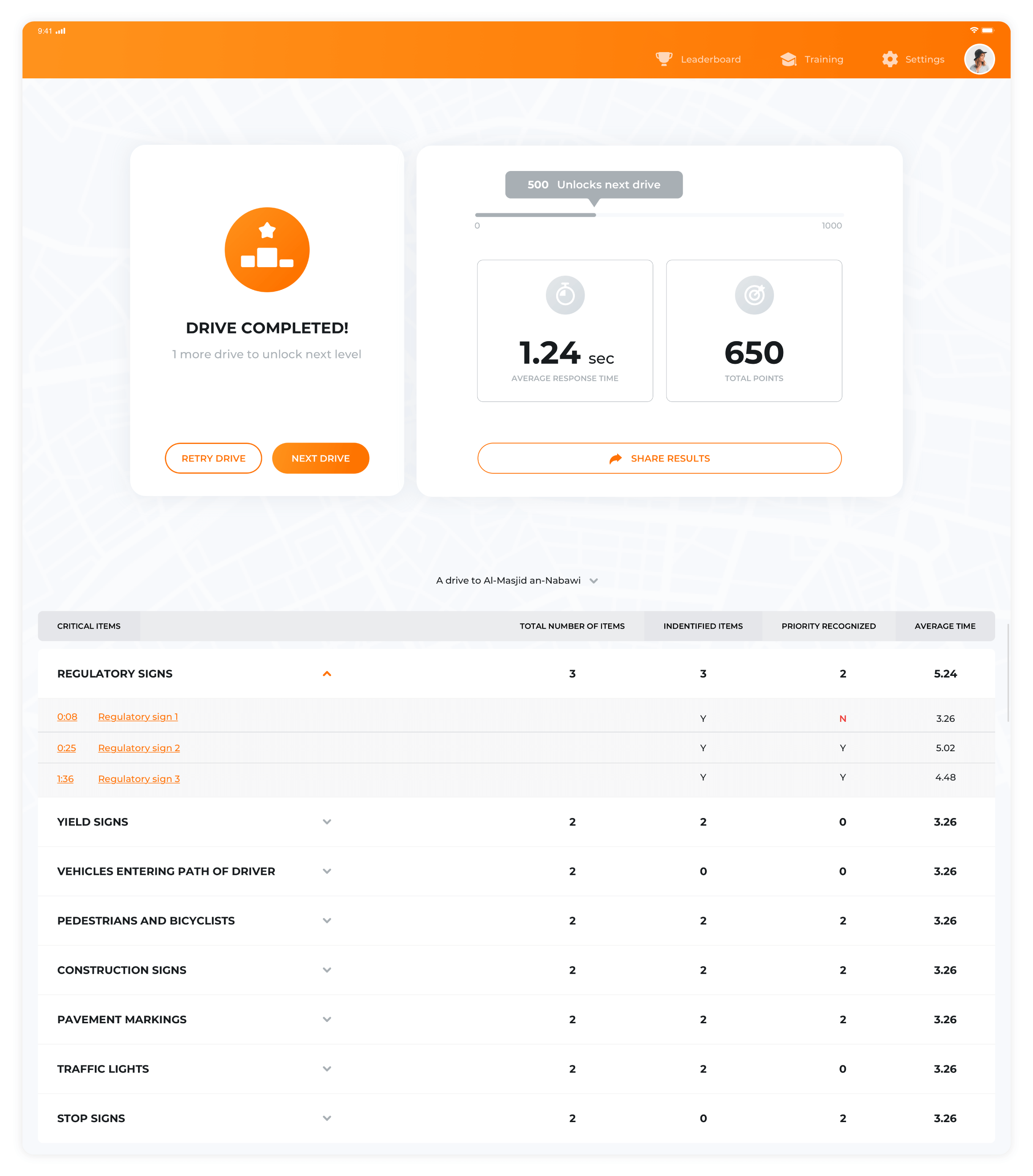
The drives and tours differ according to the complexity of the driving situation displayed in the video. Users might only start with the easiest drives within the easiest tours. As soon as the user finishes the drive, the app shows how fast they tapped each critical item and whether the user has recognized the item’s priority.
Whenever a user reaches 500 points or more for a drive, they are allowed to move on to the next drive. The score depends on the driving speed, user’s reaction time, correct number of the indicated critical items, and correct priority of the critical items. In case the user cannot pass a particular drive, they are invited for additional training.
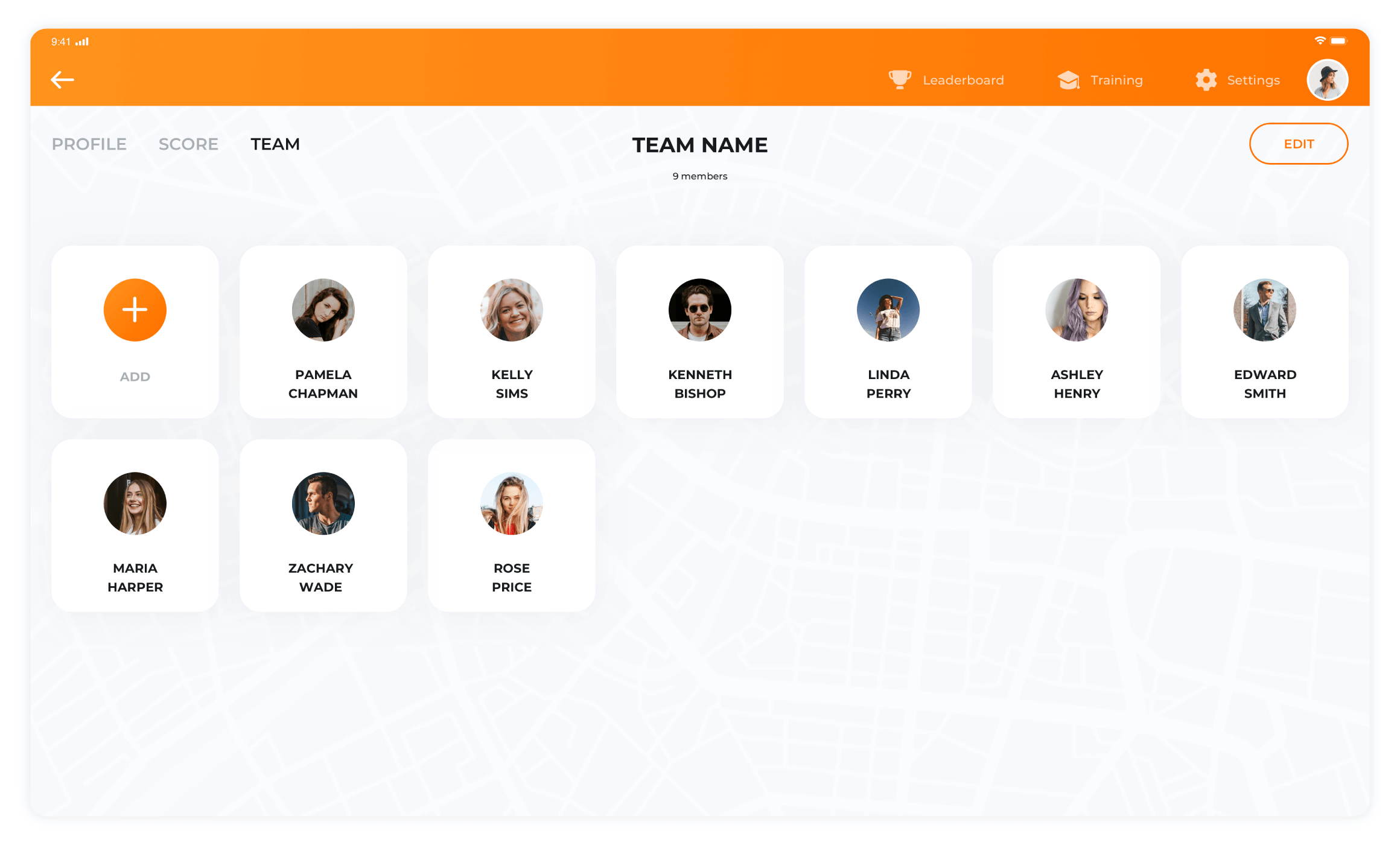
The app’s functionality is distinguished by its commanding and competitive spirit. Users might create “teams” and compare their results on the leaderboard as well as share via messengers and social networks. Teachers from driving schools might also analyze the results of their students via the leaderboard.
At the same time, users can play the video slower, up to 60% slower than the initial speed. This works particularly well for people with problematic reactions. However, in the case of command competitions, users get a lower score for slower speeds.
Since the app has been integrated with Microsoft Power BI, users might list the emails of those who they would like to share their results with in the settings. As the app records each user’s result, Drive Focus also serves as a perfect analytical tool for students, teachers and researchers.
The research has already shown that as little as 10 minutes of Drive Focus a day improves driving reaction. For those users with problematic eyesight, there are detailed readable instructions. Furthermore, it is possible to switch the app’s sound off.
Challenges and Solutions
-
The App’s concept
First, we had to achieve the right balance between the gaming element and the education component. While we had to attract users’ attention, we could not forget about the app’s primary task, which is to train users in the visual driving environment. Therefore, we introduced several gaming elements, most notably the leaderboard, score, and commands’ competition. At the same time, we also developed training modules.
-
The App’s videos
All the app’s videos appear in good quality and thus weigh a lot. Therefore, we had to decide whether the app should work online or offline. In the case of the app functioning just online, users with the poor Internet would inevitably face difficulties with the videos’ streaming in real-time. Therefore, we decided that the app would function both online and offline, and users would simply download the videos into their tablets beforehand.
-
The App’s design
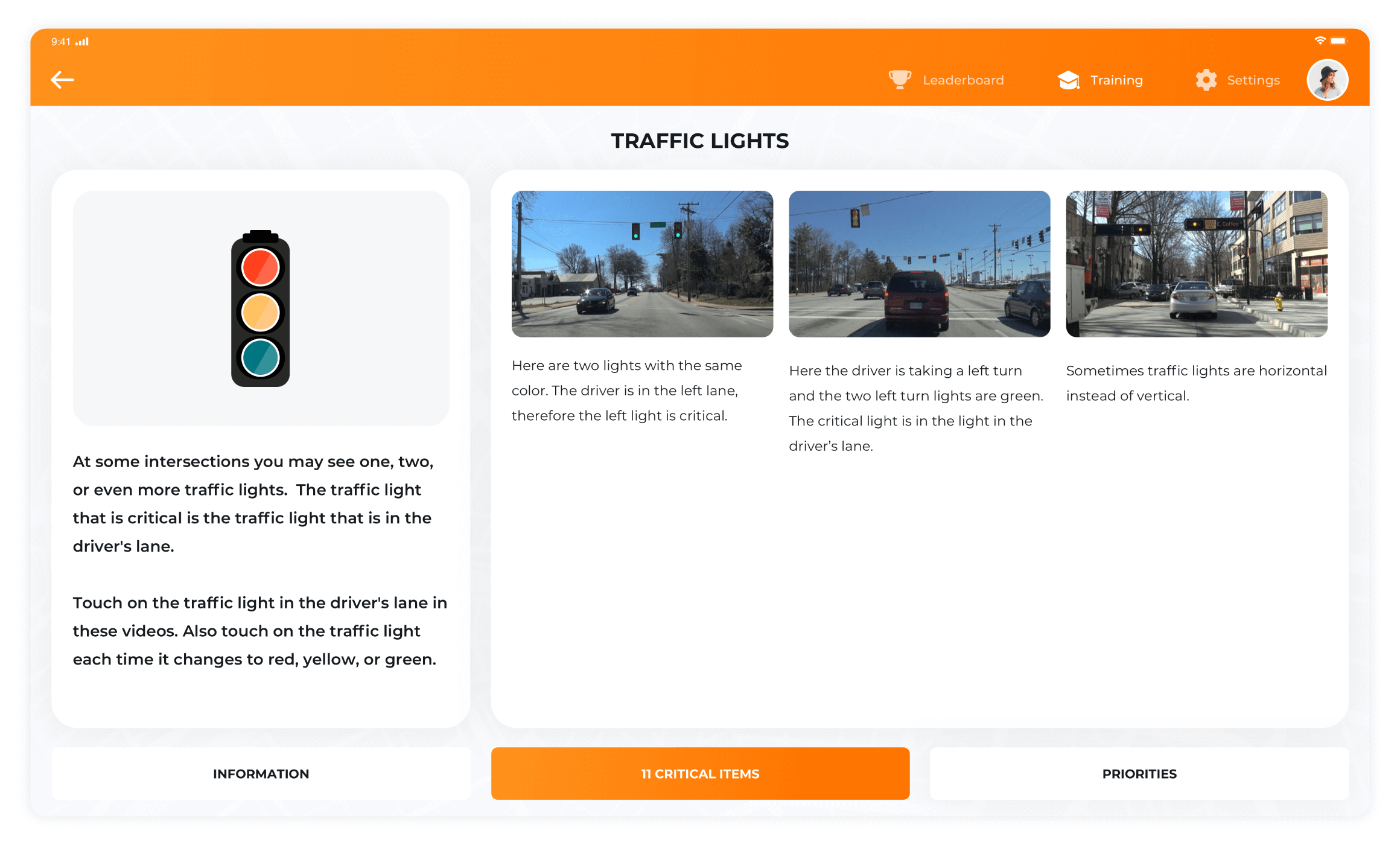
As we initially received a poorly functioning iOS app, we had to use it as a basis to create the Android app for tablets. All the previous app design elements, such as download progress, “install”/“delete” buttons, and dialogue windows could not be displayed correctly for Android. We have designed the new buttons so that they changed their colors when users pressed them as well as added their contextual description.
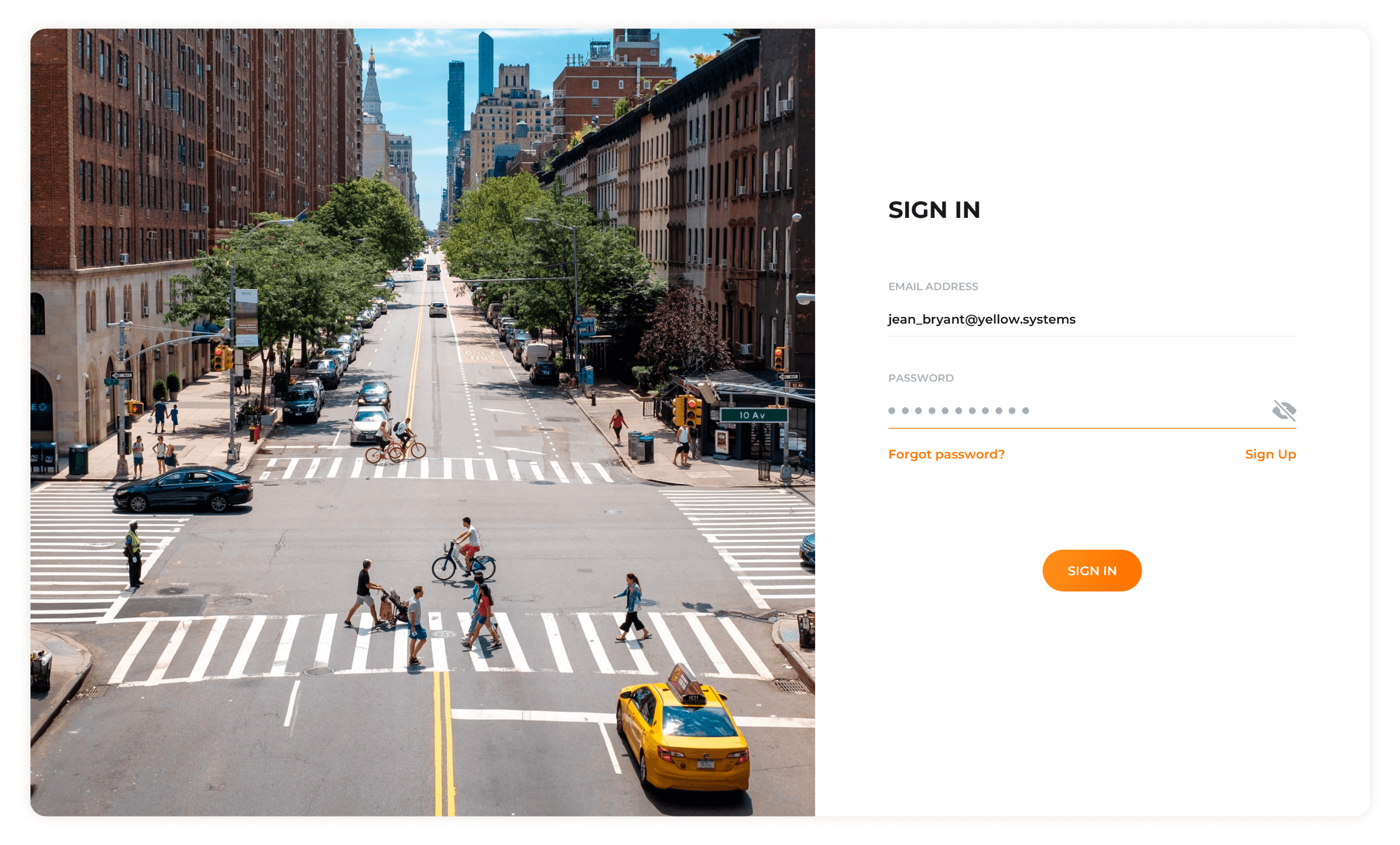
We also paid particular attention to creating an adaptive interface for people with problematic eyesight. Right now, the interface quality won’t deteriorate in case a user increases the text’s font size.
The app’s structure became another challenge. We had to make a complete rearrangement of user profiles and the data contained there.
-
The App’s data structure
As the app contained plenty of information about each critical item simultaneously appearing at each particular second during each particular drive, we had to find the proper structure to arrange such huge amounts of multiple data sets. Therefore, we selected the “Interval Tree” data structure.
-
The App’s critical items’ simultaneous display
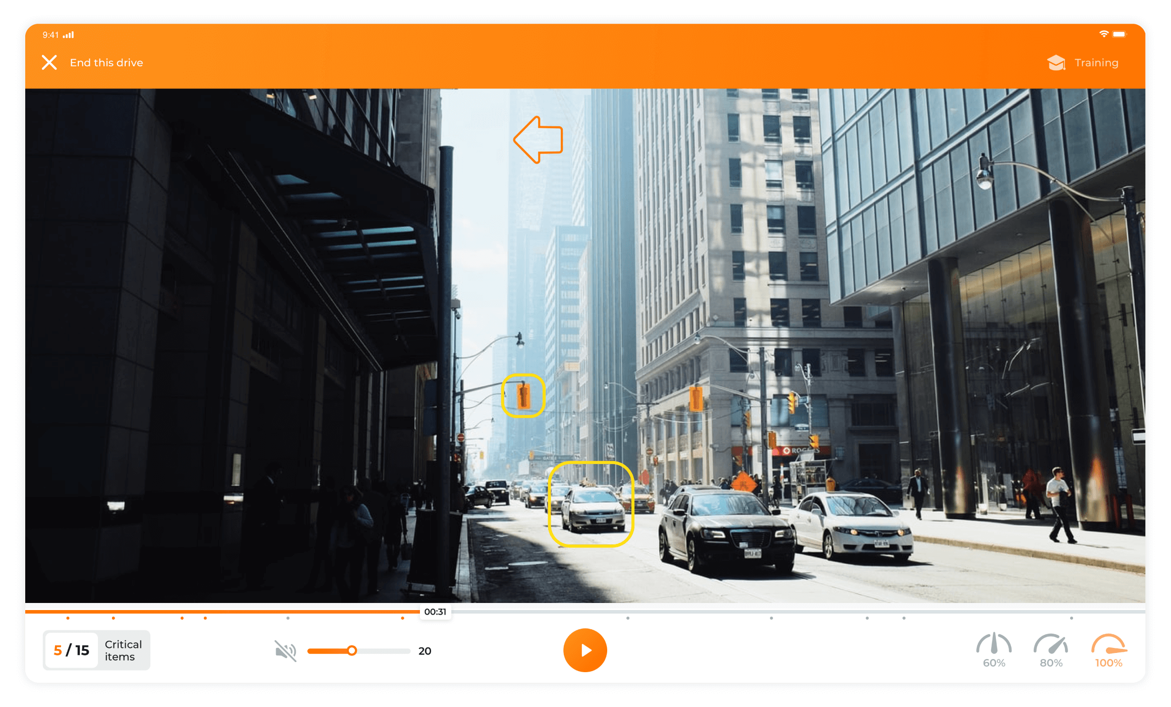
When a user passes a drive, a number of critical items might be simultaneously displayed. In this case, the user has to frame the critical item with the highest priority. However, all of the simultaneously appearing critical items have to be synchronized together with the displaying video as well as with the user’s frame. To resolve this challenge, we have used linear interpolation. Such an approach is also frequently applied in animation when two keyframes are used to mark up the video.
Conclusion
To sum up, we have created a unique training app for drivers containing both gaming elements and education components. We have resolved a number of challenges related to the app’s design, videos, and data structure.
While working with the project, we started with data display concepts and registration procedures. Our team selected Koltin as one of the most dynamic and flexible programming languages. Later, we switched to structuring the app’s content and framing the new design, adding sound, elaborating settings and their synchronization with the back-end. Finally, we completed score calculation and expanded user profiles by adding photos and regions.
At present the app is almost ready, and right after the product's completion the client will start their promotion in the United States.
If you are interested in building a healthcare app or have an idea for another industry like mobile apps for tourism industry, feel free to frop us a line!Do you have any questions?
Get in touchGot a project in mind?
Fill in this form or send us an e-mail
Subscribe to new posts.
Get weekly updates on the newest design stories, case studies and tips right in your mailbox.
