- AI Transformation
Our AI Team
Sofia
Ivan
Vlad
Anton
Technolody Stack
Our Clients
Featured Cases
- Services
Full Cycle Development
By Industry
- Works
Other projects
AI Learning PersonalizationSmart content recommendationsHotel AI ConciergeAI assistant for hotel guestsClaims Documentation AutomationPlatform for faster claims processingAI for Candidate ScreeningSmart HR efficiency boosterAI Voice AgentAI agent for hands-free learningLLM Legal SummarizationEfficient and fast legal summariesVision-Based Driving AssistanceReal-time threat detection system - Company
Yellow in Numbers
$2.1B+
Value generated through AI innovation47
Custom LLMs and AI agents deployed30M+
Engaging with products we created98%
Projects delivered within agreed budget


February 27, 2019
How to Design a Software Product: Process, Tips, and Key Principles
Find out how to create a web and mobile design that will make the experience of interacting with your product pleasant and effective.
The software market is as competitive as it has never been before. Users have become very demanding, expecting mobile and web solutions to be as simple and user-friendly as possible. Since there are billions of products, in most cases, it's extremely difficult for both developers and businesses to convince users to install and use the app.
But an even more difficult task is to gain their loyalty. To achieve success and win over the audience, you should place a key emphasis on design, thinking it through as thoroughly as possible.
What is software product design?
Let’s start with the simple definition of the product design process. Product design is the creation and ongoing iteration of the software to address the user’s needs. The main purpose of any product is to satisfy the customer by defining what their problems are and offering an effective solution to them.
The understanding of your end-users is the most crucial point in product design. The software is based on users’ habits, pains, needs, disappointments, desires, and expectations.
The perfect result of this process is a seamless software app that needs the minimum amount of instructions. Users should navigate around the app without any bumps, stops, and misunderstandings. Also, everything that happens under the hood and is not shown to users also should work flawlessly.
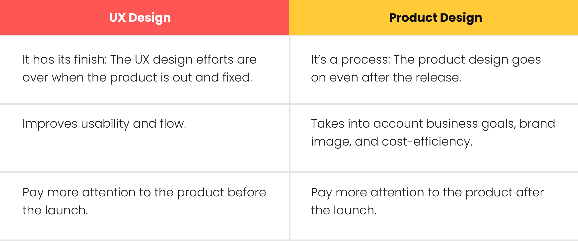
But product design doesn’t stop right after the release. It’s an ongoing process of upgrading user experience, adding more features, and fixing the app if necessary.
The difference between UX design and product design
Some people confuse these two types of design. It’s easy to explain since both of them have several touchpoints. For example, both product design and UX design require design thinking and a user-oriented approach. Also, the overall strategy consists of the same main steps like analyzing, prototyping, and testing. However, there are plenty of features that tell the difference between them.
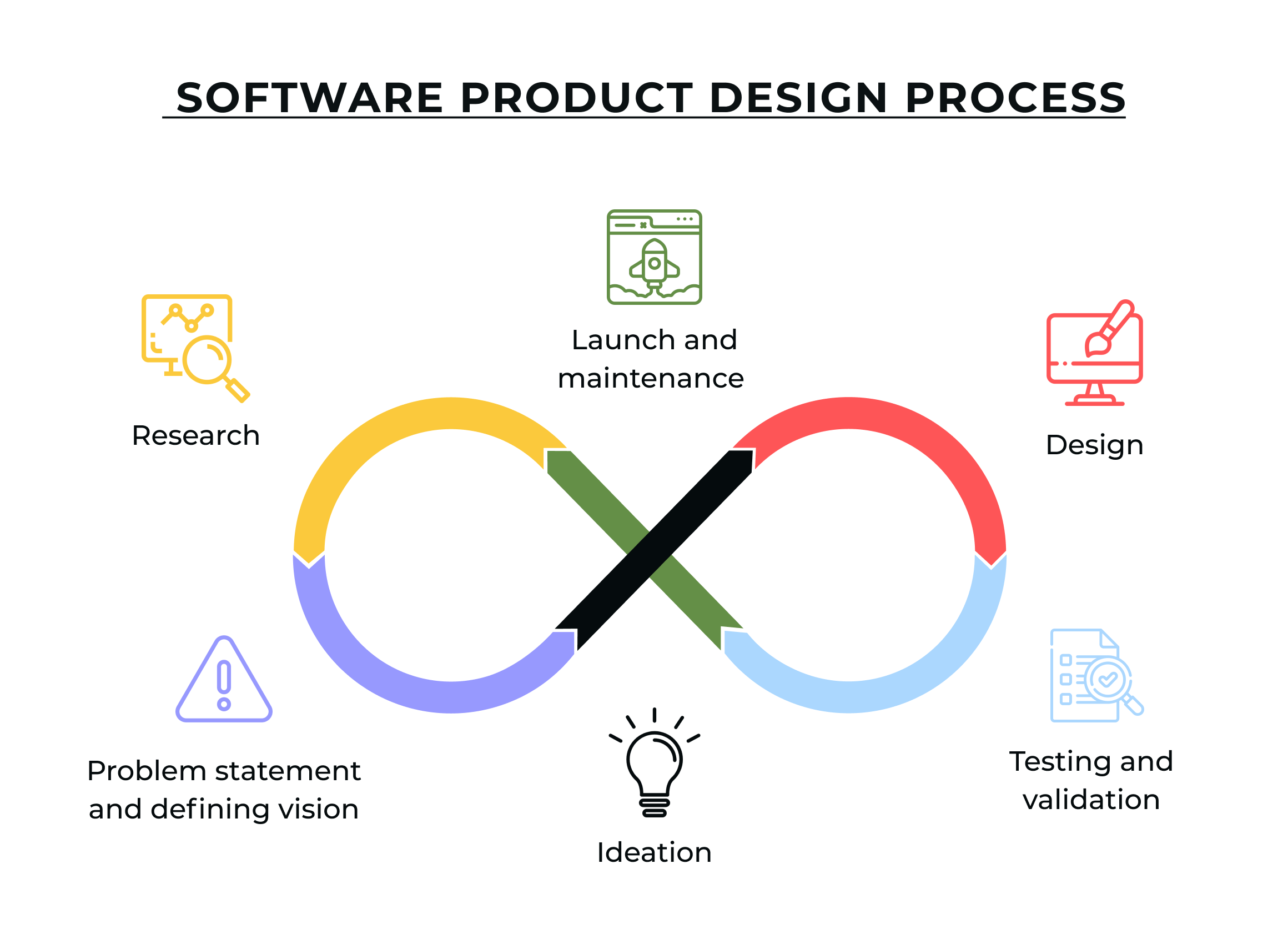
Software product design process
Now, when we know why product design is not UX design, we can take a closer look at the process itself and define its main steps.
In general, the strategy will consist of the following stages:
- Research
- Problem statement and defining vision
- Ideation
- Design
- Testing and validation
- Launch and maintenance
Let’s talk about them in more detail.
1. Research
Time spent on research is never wasted. Before starting the product design, you should look at two main factors that will influence your further actions: end-users and the market. You should analyze what your potential users already have, what are their desires, and why they need your product. For the market, you should know what it already offers to people so you won’t repeat the existing product and will stay afloat.
2. Defining vision and building strategy
The market and user research provides you with the necessary data to define the problem and set clear goals. It would be extremely hard for your team to or on a project whose final purpose is vague. The vision and defining the problem will set the overall direction for your project and stick to it.
Now you have the overall vision and you can create a product design strategy. The difference between them is when vision asks “why,” strategy asks “how.” A well-built strategy will guide you and your team through the design process and will save you from chaos.
3. Ideation
Ideation is time for brainstorming. Here you think about the possible solutions for the problem you stated before. You can generate ideas by user story mapping, sketching, wireframing, and creating scenarios. It’s important not to get stuck with the first solution you came up with. Sure, it may be the best one, but you cannot guarantee it without comparing it to other ideas.
4. Design
Well, the name speaks for itself. After the ideation, you can start creating a prototype to see if it works. Also, the prototyping stage will allow you to see the mistakes and bottlenecks before further work starts. That way, you can fix them at almost no cost.
Also, you should create design specifications. They are detailed descriptions of the product that includes everything connected to user interface design. It’s necessary for developers to take the design into production.
5. Testing and validation
To get valuable and even surprising insights on your product, you should test it. This stage starts when the high-fidelity design is ready. It can be done either by your team or by real users. They will share their feedback that will help you understand if what you’ve done is right and worth the effort.
6. Launch and maintenance
Testing was successful, and now your software is out. New users come, the popularity is growing. Now you should direct all your resources to the post-launch support. Listen to what your end-users say, conduct more tests and research, analyze new data, find new problems and solutions, and update the app. Then repeat the cycle.
The key software product design principles
Today, it's not enough just to solve a user problem. A mobile or web product must do it in the simplest way while also providing an amazing user experience. Sounds a bit complicated, doesn't it? Don't be afraid—there are 5 software solution design principles that you should know. By following them, you'll develop a great solution that has a cool design and high usability. So, let's start!
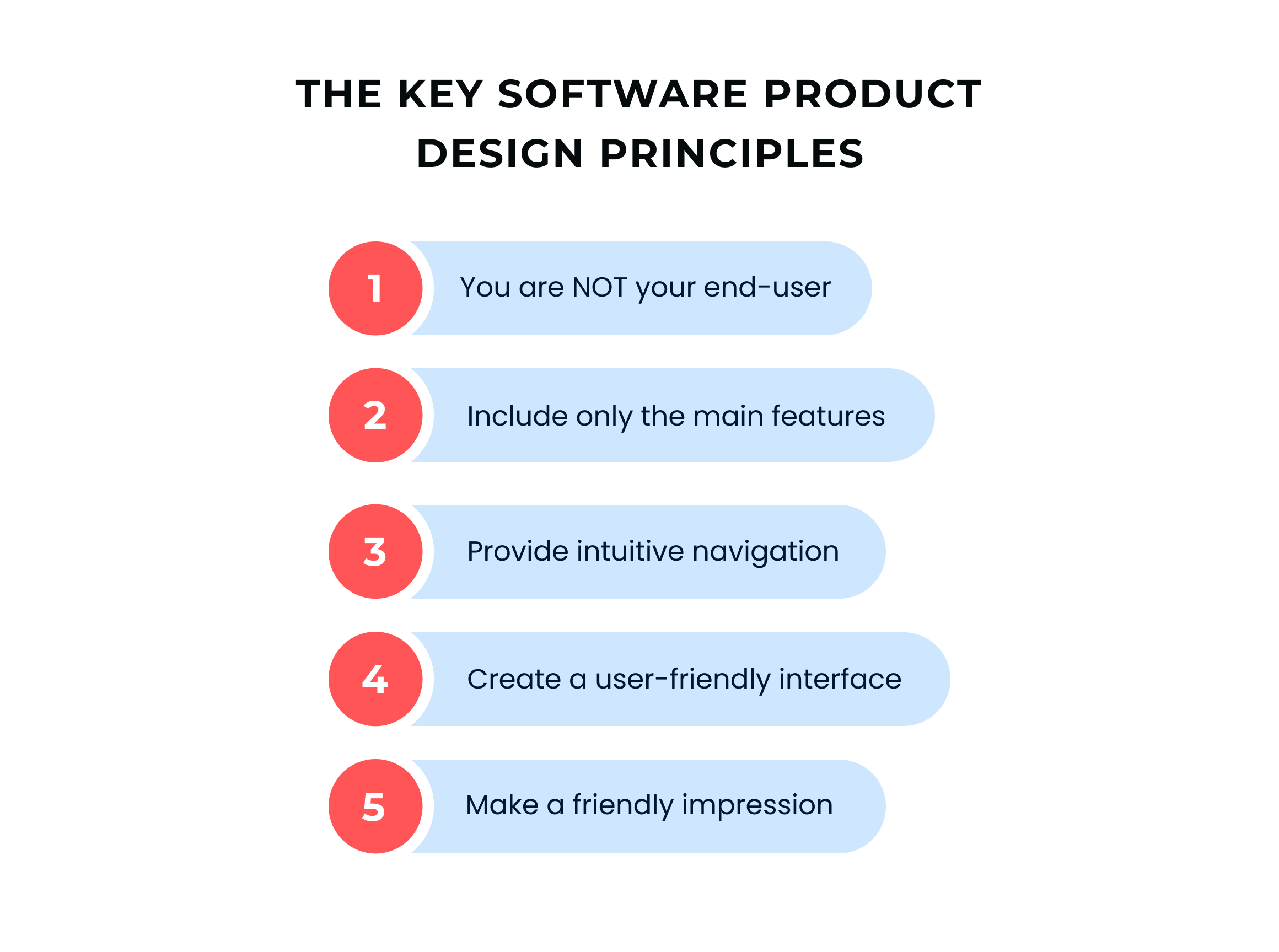
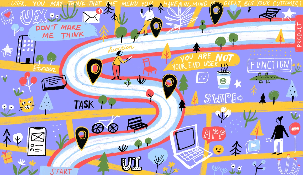
1. You are NOT your end-user
When you create a web or mobile design, always remember that something obvious for you can be a total mystery for your end-user.
You may think that the menu you have in mind is great, but your customers can perceive it absolutely differently. For instance, it may deviate from the generally accepted design standards or have a complicated structure.
We recommend that you do some research: find similar products on the market, check the number of installs, rating score, the number and quality of user reviews (you can easily find mobile apps on the App Store and Google Play, and custom software on websites like Capterra), define the most successful solutions, and take a look at their design.
2. Include only the main features
Don't overwhelm a mobile or web solution with multiple features. Users don't like when they can't understand something and get tired of "heavy" functionality. Instead, they enjoy when everything is simple and convenient. Perhaps you've heard of MVP (minimum viable product) development, implying only the key features are developed in the first version.
This approach is effective in web and mobile design, too. Define the function that will enable you to implement the app idea and solve the user problem. If you build, for instance, a mobile app for online hotel booking, the key function is booking.
You should allow your customers to book a hotel with a few clicks/taps, make a payment online, use filters to automate the search (time period, cost, location, city area, proximity to the city center, Wi-Fi, the number of rooms, etc.), and contact the hotel. And that's all.
What's important is that you should facilitate the search process to the maximum: place all the filters in one location, separate available and already-booked rooms, show the best offers in the top of the search results, give names to icons, place a search box and the main buttons ("book," "contact," "pay") in a prominent location. These small tips will help you create a software product design that meets the user's needs and expectations.
3. Provide intuitive navigation
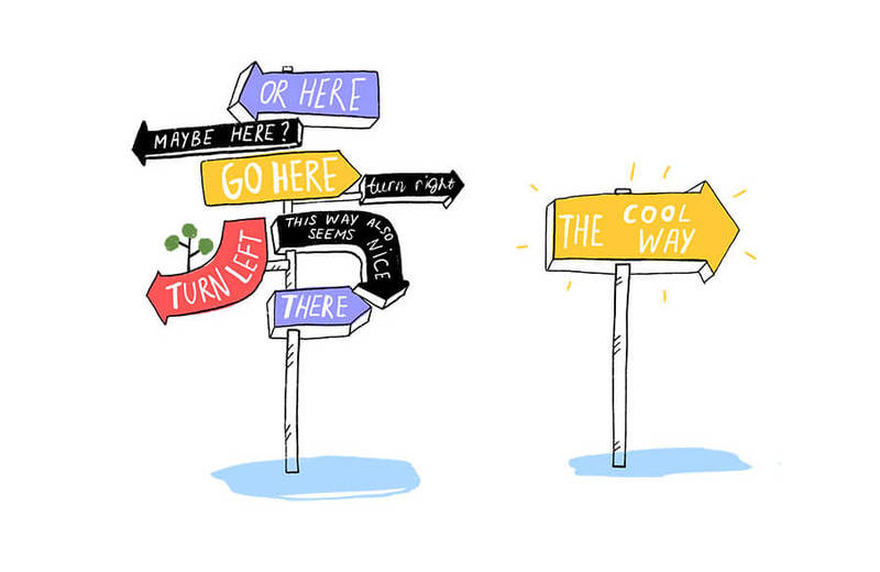
In 2000, Steve Krug, the design guru, introduced the design principle "Don't make me think" about creating intuitive navigation. Although he was speaking about web usability, this rule is successfully applied to mobile applications. By now, it has become one of the key software product design principles.
By the way, in the third edition of his book, Steve Krug included a chapter on mobile usability and said that the mobile app interface should be developed in such a way that people use the product without thinking.
To provide intuitive navigation, follow two simple rules:
- Guide your users through the app/website - each screen/page should logically lead the user to another one while giving what he/she expects.
- Make the transition between screens/pages as simple as possible - when the user opens your product, he/she should be able to quickly and easily find the desired content or do a certain action.
Good navigation directs users through the app/website and enables them to focus on the content. However, providing it in mobile solutions is a real challenge due to the small screen size of mobile devices and the need to create a contrast between the content and the application interface.
4. Create a user-friendly interface
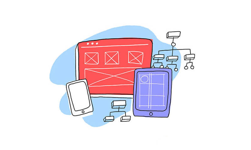
A user-friendly mobile or web interface like a good joke—it's self-explanatory. Simplicity, convenience, and clarity are the three main factors that define it. Wanting to make a cool UI/UX design, designers often look for the "golden mean" between something nice and intuitive or stylish and creative.
The ability to find the right balance is an important thing that determines the designer's professionalism and affects product success. Check out several recommendations that will help you create a great interface of your mobile/web solution.
-
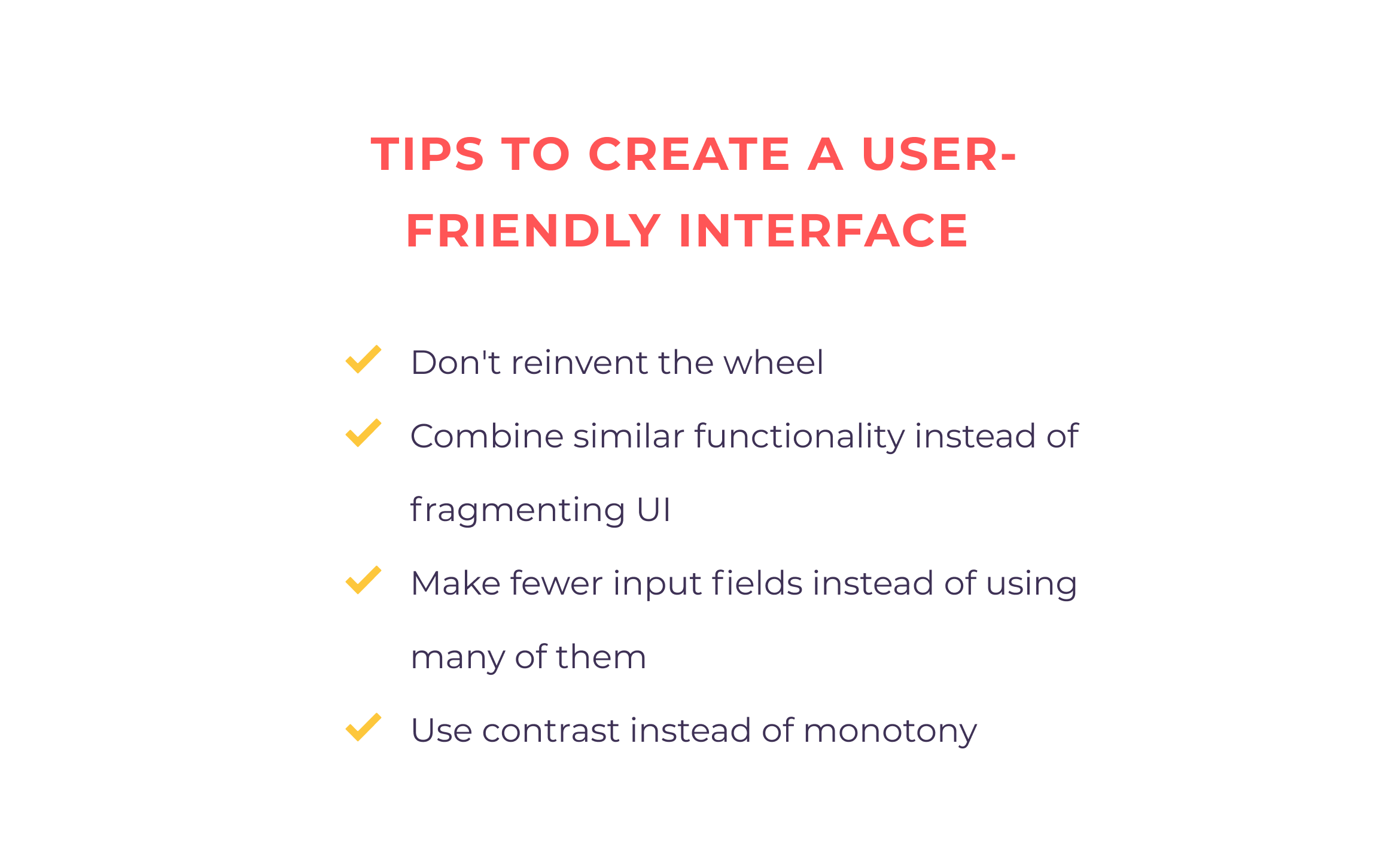
Don't reinvent the wheel
We've gotten used to having a "close window" button in the upper right corner of the page/form and expect to see it in this very place. Surely, if a designer puts it on the bottom or removes it at all, we'll be confused. The same goes for plenty of elements: icons, buttons, screens, etc.
The use of software design standards that have been formulated throughout the existence of mobile applications facilitates the life of both users and designers. When different interfaces use similar elements, the task gets even simpler.
Certainly, sometimes standards become outdated. Someone, for instance, decided to develop something extremely innovative, which resulted in the emergence of a new design trend like it was in the case of Tinder.
Instead of putting buttons such as "Yes" and "No" or "Like" and "Don't Like" when viewing user profiles, they replaced them with swiping to the left and to the right when defining whether you want to meet some person or not. After that, many product owners started using this feature.
So, if you want to move away from software product design standards, think through this option thoughtfully and test your idea on your target audience.
And we can save so much of your time and money with just one thoroughly designed wireframe
Get in touch-
Combine similar functionality instead of fragmenting UI
Users aren't happy with encountering similar functionality on different screens. By overloading the app with the same things—sections, elements, features—by doing the same, you make the product usage more difficult and less pleasant. The more duplicates you have, the fewer chances that the user will stay with you. So, if you can combine similarities in one place, combine.
-
Make fewer input fields instead of using many of them
People avoid time-consuming tasks by their nature—and in our hectic lives, filling out a number of fields is just one of those tasks. You probably get irritated when having to type a lot of information and then retype it because of a small mistake or a non-working captcha. Also, most mobile and web solutions just don't require so much user data.
Think about which fields are really necessary and remove all the others. If you do need many fields (for example, to register the company), display the forms sequentially on different pages (screens) so that one page doesn't have 10 or more fields. Also, create an indicator showing your users how many pages are left.
-
Use contrast instead of monotony
It's much easier to attract a user's attention and motivate a customer to do a certain action with the help of contrast. That's why a mobile or web interface should highlight the information you need. By doing so, you will increase the conversion rate, collect a higher number of user emails, and improve the app/website statistics.
You can achieve contrast with various methods. For example, you can use different colors and their shades or make some elements seem to be closer than others by applying shadows and graduated fill. To achieve the best result, you should clearly separate a call-to-action from the rest of the screen.
At the same time, don't overload the page with a lot of elements. Instead, make the main focus on attracting the user's attention to the conversion actions by choosing bright, different colors for the contact and callback forms, buttons for adding goods to the basket and leaving an email, and more.
Also, if you're developing a business application for the company's clients or employees, use the colors of your corporate/brand identity. If you're building a B2C solution for ordinary users (e.g., a fitness or dating app), design it in one style.
5. Make a friendly impression

Show the value of your software solution before asking users to create an account. They avoid products that require an immediate obligatory registration.
You should pay special attention to this rule if your brand/company isn’t famous and you need to promote the app. In the case of a pizza delivery service, online store, or hotel booking platform, a successful solution is to ask for registration before the checkout.
A good way to attract users, improve customer loyalty, and increase the conversion rate is to offer some gifts, for instance, a discount or a free trial period. You can place it on the first screen—it will become a friendly gesture convincing users to try your product. It’s an effective psychological technique: if you do a favor, a person wants to do something in return.
What’s more, the user starts thinking about you better. We all appreciate things like Uber promo codes and Canva’s free trial period. No wonder that so many businesses use this approach in their product marketing strategy.
Tips you should keep in mind when designing a software product
The statements described above are the list of basic principles to ensure that your app will reach its audience and make a perfect entrance to the market. However, to create an A+ application, you can use some tips:
- Functions go first. If you decide to implement an app with a fancy and extravagant UI, don’t forget to seamlessly merge it with functional UX. Beauty shouldn’t harm usability.
- Try not to overcomplicate the app. You would want your product to have a wide set of functions, beautiful design, and a lot of integrations, but it’s not necessary. Start with something small.
- Good ideas don’t equal good application. You should take a lot of factors into account, so follow the design process and rely on the audience’s feedback.
- Including certain features should be backed up by the end users’ advantage. The users decide what they want to see in your product and it’s going to help them.
- Create prototypes. They will help you see the user flow clearly and quickly fix crucial mistakes without additional costs.
- Follow trends in your market niche. Users want to receive the most modern solution, so provide them with it.
- Take marketing into account from the very beginning. Your audience won’t find you if you don't analyze the necessary marketing channels and build a promotion strategy.
Follow these tips and your product will definitely survive the competition and attract more users.
Final words
Today, users need just a few seconds to understand whether they like the app or website or not. So, to convince them to use it and build customer loyalty, you should provide them with a seamless user experience. Following the aforementioned software solution design principles will help you develop a successful solution.
Have some questions about the topic? Wonder how to balance UI and UX and create a cool user-friendly web and mobile design? Have a project idea and want to discuss it with a reliable software design company?
Feel free to contact us!
Get in touchGot a project in mind?
Fill in this form or send us an e-mail
💻 What is software product design?
💻 Why are UX design and product design different?
💻 What are the key software product design principles?
💻 How can I enhance my software design?
Subscribe to new posts.
Get weekly updates on the newest design stories, case studies and tips right in your mailbox.