- AI Transformation
Our AI Team
Sofia
Ivan
Vlad
Anton
Technolody Stack
Our Clients
Featured Cases
- Services
Full Cycle Development
By Industry
- Works
Other projects
AI Learning PersonalizationSmart content recommendationsHotel AI ConciergeAI assistant for hotel guestsClaims Documentation AutomationPlatform for faster claims processingAI for Candidate ScreeningSmart HR efficiency boosterAI Voice AgentAI agent for hands-free learningLLM Legal SummarizationEfficient and fast legal summariesVision-Based Driving AssistanceReal-time threat detection system - Company
Yellow in Numbers
$2.1B+
Value generated through AI innovation47
Custom LLMs and AI agents deployed30M+
Engaging with products we created98%
Projects delivered within agreed budget


August 4, 2020
The Importance of Responsive Web Design: Benefits, Guidelines, Future Trends
The variety of displays is constantly growing, and the number of devices that can access the Internet is growing too. Your website should adapt to such changes, otherwise, it will lose users. How to keep pace with the screens? Use responsive web design!
It’s hard to count all the types of screens and displays that exist now. The number of their sizes and configurations is truly huge, and people use them for various purposes.
The more screens people use, the better software should adapt to them. The quality of the visual elements should stay the same across all user’s devices, from a smartphone to a high-resolution monitor. No matter if it’s a complex website with lots of screens, animations, and pictures or it’s just a simple landing page with one button—everything must look good.
How to complete this task? Use responsive web design!
So what is responsive web design?
📌Well, the definition is pretty easy: Responsive web design means that your website will look good and will be easy to use on any device. It mostly applies to mobile and desktop devices, as they constantly change in their sizes and proportions.
For example, the latest screen sizes on smartphones always seem to be increasing. Moreover, foldable and flexible displays appeared, and they brought new challenges to designers and developers
📌Responsive web design was invented in the early 2000s, and Ethan Marcotte was the first to use this term. He described the theory and practice of responsive web design in his book named Responsive Web Design in 2011.
📌The basic statement that explains how responsive web design works sounds like this: Your website should adjust to the needs of your users based on the device they are using at any given time, and provide the relevant functionality for this type of device.
For example, a bank website can have two layouts with two different focuses: Their mobile layout can focus more on viewing numbers and balances, while the desktop layout might more prominently show financial operations like transfers.
📌Going further with the banking analogy, responsive web design needs to give users the ability to perform the same operations on a mobile device that they’d want to perform on a desktop or a tablet. It would be strange if one of the website versions wouldn’t have the full functionality, wouldn’t it? Your designers should account for different screen sizes by changing fonts, input fields, and other layout elements accordingly.
Do you have any questions? Feel free to ask them and we'll be right there for you!
Your friends at YellowResponsive design vs Mobile website
Besides responsive web design, there is another popular way to address mobile users’ needs and it’s a dedicated mobile website. The difference between these two is simple. Responsive web design implies only one website that automatically adjusts all its elements to the necessary screen size. A dedicated mobile website is a separate website that targets only mobile devices. When a user clicks on a website’s link, it quickly defines what device is used and shows the relevant version. Usually, such websites have “m.” or “mobile.” subdomain.
We can compare these solutions by SEO, user experience, and costs.
SEO
This point definitely goes to responsive web design. A mobile version is hosted on the above-mentioned subdomain, meaning it delivers only a part of its authority to the main domain. Since a part of search ranking depends on the quality of incoming links, such a division may become a bottleneck.
UX
Regarding web design, user experience is a complicated issue. On the one hand, there are cases where a dedicated website can address mobile issues better. It can provide more suitable navigation or an easy e-commerce function.
On the other hand, visitors barely pay attention to what website they visit, a dedicated or a responsive one. But when they do notice, they will see how the mobile version differs from a desktop one and may feel deprived.
Costs
This is the most uncertain point regarding responsive design and a mobile site. It’s hard to say right away which solution will be cheaper. It depends on the scale of your website and the number of updates it gets in a period of time.
When you already have quite a website, a separate mobile site would be easier to create but if you are building everything from scratch, integrating a responsive web design in the very beginning is a smart decision.
Besides, a responsive design is better for websites that have often content updates. It gives you the ability to manage content for all devices at the same time. Adding new pages and fixing mistakes for two versions of the website will end up in more maintenance costs.
Why your website needs a responsive web design
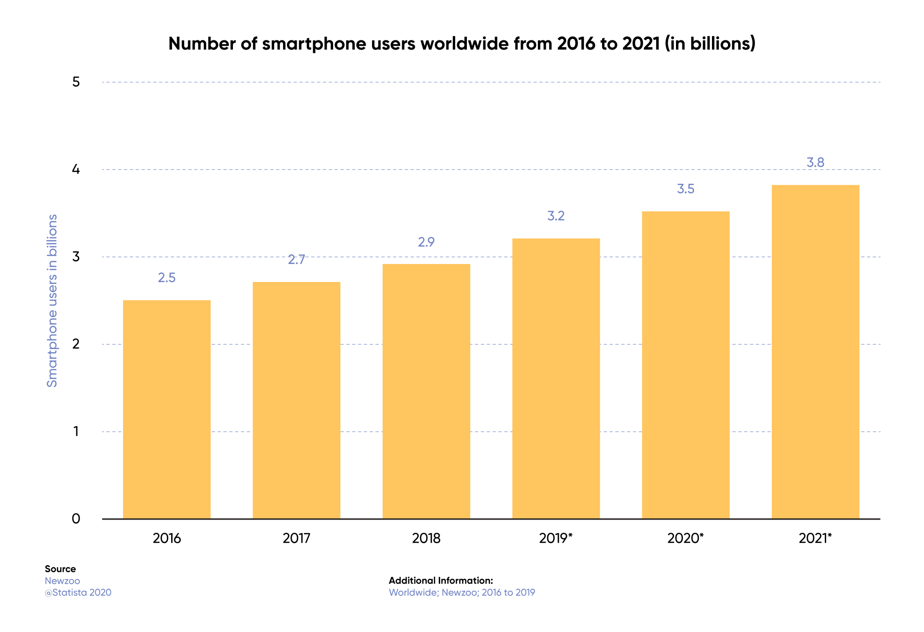
Whether you need a simple landing page or want to embark on marketplace website development, responsive web design matters. Mobile device use has exploded in the last ten years, and most people access the internet through mobile platforms. The number of smartphone users is only increasing with time, so making your website mobile-friendly is a really good point.
1. A GlobalWebIndex research conducted in 2018 proves that point. In this survey, 87,000 smartphone, tablet, and computer users were asked about the most popular way they access the Internet. 95% of them admitted that smartphones are their primary means to connect with the internet. For 93% it is their desktop, and tablets occupy third place with 73%.
Additionally, the proliferation of IoT (Internet of Things) devices is increasing, with smart fridges, washing machines, watches, printers, speakers, and even houses allowing users to access the web. If you want to capture these consumers, you need to create a website that looks good and works for the devices they use.
2. Responsive websites are more popular with users. Websites with prominent social media features that can be accessed on mobile devices are more likely to be shared by consumers.
Conversely, if a user can’t access a site with their desired device at any given time, it’s more likely they’ll look for an alternative (your competitor, to be precise) that does support their device. Actually, 94% of users mention web design as a reason for trusting or not trusting a website.
3. Finally, responsive web design is good for SEO and search result rankings. Google is now favoring websites that pay more attention to mobile optimization for smaller screens. The platform has stated that their search algorithm vastly prefers the simplicity and layout that a single URL responsive website offers. Separate websites for mobile or other devices spread out those rankings.
Benefits of responsive web design
There are more benefits that responsive design can bring to your project:
- More mobile traffic. The use of smartphones increased and people now can access the Internet at any time in any place. If your website can adapt to mobile screens of any device people use, it can expose your solution to a wider audience and bring you more traffic.
- Fewer maintenance needs. Since you don’t have to manage two versions of your website separately, less time and money is spent on it. A mobile site requires additional testing and support, especially if you try to adapt it for each screen separately.
- Easier to analyze. Managing several versions of a website requires your team to follow several user flows and track down a lot of redirects. Having one website for all devices significantly simplifies the process.
- Lower bounce rate. With responsive web design, you can organize a much better user experience. It’s easy to navigate around a responsive site so there is a higher chance that users will stay on your website longer.
Guidelines for Creating Responsive Content
When you have implemented responsive web design, it’s time to create responsive content! When creating content for a responsive website, it’s important to divide it into small digestible chunks. Users might be viewing one block of text or image at a time, or they might want to devote a large screen to it. Your designers and engineers should communicate with your content creators and discuss all the details like:
- Line and character limits
- Font and stylization limits
- Image sizes
- Types and number of input fields
- Load times
In general, the shorter and more modular the website content is, the better it will be perceived by users. This will prevent content from looking ugly or being inaccessible on your site. Such an attitude will save designers from the task of reformatting content, and engineers—from rebuilding the website’s pages.
How you can get responsive web design
Responsive web design is a constantly evolving practice. It can be really difficult because creating responsive web design involves writing code and testing on multiple devices. This designing process is hard to achieve because it requires tight communication and cooperation across multiple departments.
Designers and engineers should know how to implement the following elements of responsive web design:
- Flexible Layout Elements such as images and input
- Media Queries for determining user devices
- Breaking Up Content to make it more flexible
- Showing and Hiding Content to make it more accessible
It’s important for content creators to understand the limits of the design, as we outlined in Guidelines. Finally, you need a robust QA environment equipped with multiple devices to ensure your design and content works together as smoothly as possible.
The future of responsive web design
Despite responsive web design’s dominance among web solutions, this technology still has paths to grow.
Wearables
Most modern smartwatches don’t have browsers on them. Why? Because for now, it’s impossible to show web pages on a screen with such small parameters. The device itself cannot be bigger because it becomes unwearable. The task of responsive web design is to solve that issue.
Audio interface
Voice recognition is not a novelty in 2021, but it’s still not a widely used technology. Can you imagine someone on a bus or on the street talking with their wearables and asking something like “show me the nearest coffee house”? Since audio interfaces are not the most private ones, responsive design will be a great alternative to them.
More mobile usage
Google already requires all websites to have good mobile optimization if they want to appear higher in the search. They should have readable text, adaptable visuals, and reasonable load time. The amount of smartphone users is rising, so there are going to be even more requirements for mobile versions of websites.
To sum up
Responsive web design is a practical method to meet the evolving needs of users with various digital devices. It requires a 360-degree awareness of customer needs, design specifications, engineering practices, and content creation. Companies that can achieve responsive web design can access a growing consumer market that has not yet been fully tapped.
Got a project in mind?
Fill in this form or send us an e-mail
What is a responsive web design?
How does responsive web design differ from a mobile website?
How to create responsive content?
What are the elements of a responsive web design?
Subscribe to new posts.
Get weekly updates on the newest design stories, case studies and tips right in your mailbox.